Famous and Successful Logo Redesigns
As we realize that we are now living in the Brand Era, where everything is branded and labelled we are more concern to companies we believe can help us, shops where we can get our supplies, or websites we trust to keep our data or information securely. This is how a company’s logo appeal as the first thing costumer will consider to trust or not.
Among thousands of logos out there, some of them may look cheesy and cheap, and some visually give us confident. In order to grab our attention and get our trust, many companies even consider to re-brand/redesign their logo. As might be expected, the company will have to take the risk and be prepared of the pros and cons of this act. They should have really consider the reasons behind the redesign of their brand.
Below is a list, in no particular order of what I think to be famous and successful logo redesign from their old logo to the latest with explanations of what has been improved.
1. Toys R Us
Toys R Us has been the second largest overall toy retailer in the United States with many branch chain which located in Europe, Asia, Oceania, Africa, and Canada.
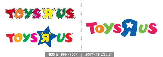
Old Logo History:
The yellow reverse “R” in quotation marks, which is similar to the Cyrillic letter Я, (ISO 9: Я), imitates a small child’s backward writing of “R”, which is short for “are”. The “R” is the most distinctive part of the retailer’s colorful kid-friendly logo. The current, modernized Toys “R” Us logo was introduced in 1969 as the first logo, then a blue star was added to the logo in late-1998/early-1999 during the Toys “R” Us “Concept 2000″ era.
New Logo – What has been improved:
On September 24, 2007 the logo was redesigned with alternating sized characters and a star in the middle of the reverse R. The letter R was changed from yellow to blue. In this new logo, the company achieve a better shape for the font character, leaving the “classic” feel behind and gives a bright and fun feel to it.
2. UPS
UPS, short for United Parcel Service, Inc. is the world’s largest package delivery company. Headquartered in Sandy Springs, Georgia, United States. UPS is well known for its brown trucks, internally known as package cars (hence the company nickname “The Big Brown Machine”).
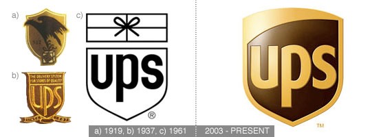
Old Logo History:
The iconic package and shield originally designed in 1961 by Paul Rand. It became their original logo and first saw use in 1916 when the company was American Messenger Company. In 1935, the logo was redesigned to reflect the company’s new name United Parcel Service.
New Logo – What has been improved:
UPS decided to re-brand themselves in 2003, the new logo was designed by New York-based FutureBrand and it represents a strategic decision to emphasize UPS’s expanded business operations. All four designs for the logo shared the shield theme, but the new design clearly feels much more modern and and clean. Although the logo obviously doesn’t direct us to the shipping company, it gives the safe feel with the shield on the logo, knowing that our package will be protected.
3. Skittles
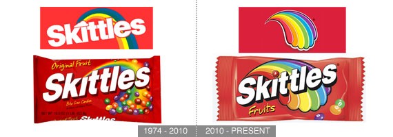
Skittles is a brand of fruit-flavored candies which were first made commercially in 1974 by a British company.
Old Logo History:
Candy brands are some of the most enduring brands in the market. Skittles have the excellent & long standing tag line ‘Taste the Rainbow”, with this tag line the company only focus on the rainbow color for additional effect behind their “Skittles” text which in this case become their logo.
New Logo – What has been improved:
Miles Newlyn admitted that concept & design for the new Skittles logo is not his but that of Dragon Rouge. Nevertheless, The colorful ‘tongue’ he retouched has been blogged around the internet. This multi-colored tongue concept is a literal though stylized translation of the brand’s slogan, “Taste the rainbow.”
4. MTV
Easily recognized since it’s first launched on August 1, 1981 is an American cable television network based in New York City. The original purpose of the channel was to play music videos guided by on-air hosts known as VJs. Today, MTV doesn’t play music videos, and primarily broadcasts a variety of popular culture and reality television shows targeted at adolescents and young adults.
Old Logo History:
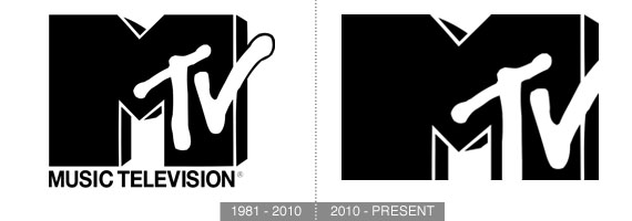
Throughout MTV’s early days, the channel’s main logo was a large yellow “M” with red letters “TV,” but unlike most networks’ logos, the MTV logo constantly morphed and adapted with different colors, patterns, and images filling in the large block letter. The very first moments of MTV after the “moon landing,” as well as the top of every hour until at least the mid-1980s, featured a rapidly changing station ID logo that changed its appearance several times per second. The only constant aspects of MTV’s logo at the time were its general shape and proportions; everything else was dynamic.
New Logo – What has been improved:
MTV’s logo has been instantly recognizable for the last three decades. Up to this point, MTV revised their original 1981 logo by excluding the “Music Television” caption under the big “M” letter, and the trailing letter “V” that branched off to the side of the original logo. Their long-running tag line “Music Television” at this time has been officially dropped since they are not primarily broadcast music videos anymore.
5. Delta Air Lines
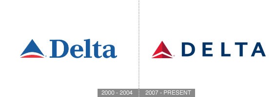
As it emerged from bankruptcy, Delta Air Lines wanted to signal to both customers and employees that the airline was “coming back new and better”. In preparation for the momentous occasion, Delta engaged Lippincott to reposition the airline with a revitalized image and redesigned customer experience that would force reconsideration of the airline.
Old Logo History:
Delta’s identity has been short-lived for the last decade or so. Throughout its history with a whopping 19 logos in 78 years — with two major identity changes. See Delta Logo Timeline.
New Logo – What has been improved:
Some people think of Delta’s redesigned logo is more to a realign than a redesign. In spite of that, Delta’s new logo now looks sharp. The colors in are more subdued and the choice of a all caps sans serif typeface gives the modern look and feel as well. This 3-dimensional red widget logo successfully reflects Delta’s transformation into a highly-differentiated, customer-focused airline.
6. Starbucks
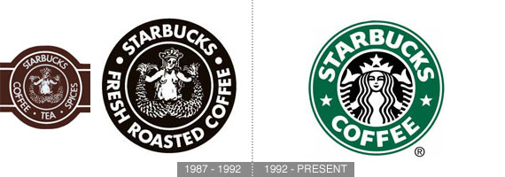
With the largest coffeehouse company in the world, we can hardly ignore this green logo from Starbucks.
Old Logo History:
The original Starbucks logo sported a wood cut type illustration of a siren from Greek mythology. The logo has been significantly streamlined over the years. In the first version, which was based on a 17th-century the Starbucks siren was topless and had a fully visible double fish tail. In the second version, which was used from 1987 – 1992, her breasts were covered by her flowing hair, but her navel was still visible, and the fish tail was cropped slightly.
New Logo – What has been improved:
Starbucks’ current logo is used since 1992, her navel and breasts are not visible at all, and only vestiges remain of the fish tails. Today the current incarnation of the logo is much more streamlined and and memorable. It is a significant and unique logo for coffeehouse furthermore giving the impression of ‘one of a kind’.
7. Sprint
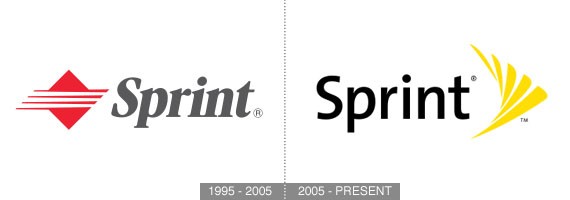
Sprint is a global Internet carrier and makes up a portion of the Internet backbone. In the United States, the company is the third largest long distance provider and also owns a majority of Clearwire, which operates the largest wireless broadband network.
Old Logo History:
The original Sprint logo was used from 1989 to 2005 with 4th variant used from 1995–2005.
New Logo – What has been improved:
When Sprint merged with Nextel a few years back they underwent massive re-branding campaign. Nextel’s attention getting black and yellow color scheme was merged with The Sprint name. The new symbol is based on sprints signature ‘pin drop’. The switch to a nice sans serif typeface also does wonders for making the logo look modern. This logo really shines when the symbol is set in motion.
8. KFC (Kentucky Fried Chicken)
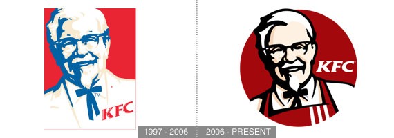
Old Logo History:
By the late 1990s, the stylized likeness of Colonel Sanders as the KFC logo had been modified and only used until November 2006.
New Logo – What has been improved:
With the colonel putting on his apron to replace his suit coat, this new KFC logo giving us the friendly and inviting feel. The new angled backdrop to the logo also adds a nice dynamic feel and implies quickness.
9. CBS Broadcasting Inc.
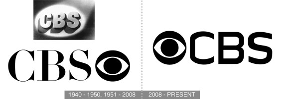
CBS Broadcasting Inc. (CBS) is a major American television network, which started as a radio network. The name is derived from the initials of the network’s former name, Columbia Broadcasting System. The network is sometimes referred to as the “Eye Network” in reference to the shape of the company’s logo.
Old Logo History:
CBS unveiled its Eye Device logo on October 17, 1951. Before that, from the 1940s through 1951, CBS Television used an oval spotlight on the block letters C-B-S.[16] The Eye device was conceived by William Golden based on aPennsylvania Dutch hex sign as well as a Shaker drawing and made its broadcasting debut on October 20, 1951. Since then the company insisted on keeping the Eye device and using it as much as possible.
New Logo – What has been improved:
Today the logo which is alternately known as theEyemark, has been slightly changed on the typography to get the modern and futuristic feel, keeping their classic long lasting Eye device logo (vaguely bigger) in the front of “CBS” characters.
10. Apple Inc.
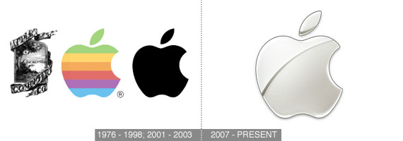
Old Logo History:
Apple’s first logo, designed by Jobs and Wayne, depicts Sir Isaac Newton sitting under an apple tree. Almost immediately, though, this was replaced by Rob Janoff’s “rainbow Apple”, the now-familiar rainbow-colored silhouette of an apple with a bite taken out of it. Janoff presented Jobs with several different monochromatic themes for the “bitten” logo. In 1998, with the roll-out of the new iMac, Apple discontinued the rainbow theme and began to use monochromatic themes, nearly identical in shape to its previous rainbow incarnation.
New Logo – What has been improved:
Entering the digital era, in 2007 Apple started to redesign their apple logo to give their customer a simple, minimal, yet modern look with the touch of chrome shade.
11. FedEx
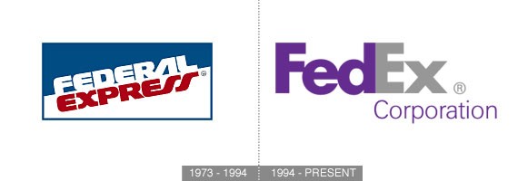
Old Logo History:
The original Federal Express logo was designed by Richard Runyan in 1973.
New Logo – What has been improved:
The Fed is always purple and the Ex is in a different color for each division and grey for the overall corporation use. The original “FedEx” logo had the Ex in orange; it is now used as the FedEx Express wordmark. The FedEx wordmark is notable for containing a hidden right-pointing arrow in the negative space between the “E” and the “X”, which was achieved by designing a proprietary font, based on Univers and Futura, to emphasize the arrow shape. Other than giving the new and modern look, this new logo with the hidden arrow was a genius idea behind their new logo, made it looks like it’s presenting the moving forward company as well.
12. City of Melbourne
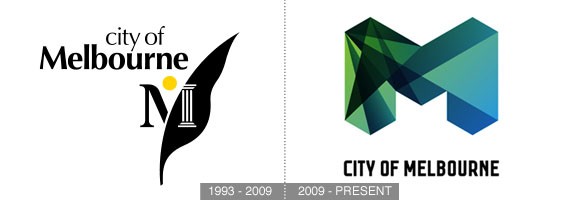
The City of Melbourne is a Local Government Area in Victoria, Australia, located in the central city area of Melbourne.
Old Logo History:
City of Melbourne first logo M and leaf symbol was introduced in the early 1990s.
New Logo – What has been improved:
The new logo received many critiques for the cost of the big “M” research and design. Despite that, this dimensional colored “M” is different compared to the other city logos on earth. Unique and sophisticated.
13. Discovery Channel
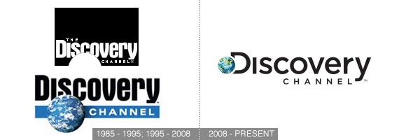
Old Logo History:
The Discovery Channel’s very first logo was a television screen picturing a map of the World. In the mid-90s, the word “The” was dropped from the channel’s name. A globe became a permanent part of the logo and a strap was added to the bottom of the logo.
New Logo – What has been improved:
Discovery Channel started using a new logo on 2008. With new graphics and the new tagline “The World is Just Awesome”. The new logo has been designed by Viewpoint Creative in Boston and replaced Aurora Bold Condensed with Gotham. The globe has been merged with the “D” in “Discovery”. Their new logo now looks more simplified and less crowded.
14. MailChimp
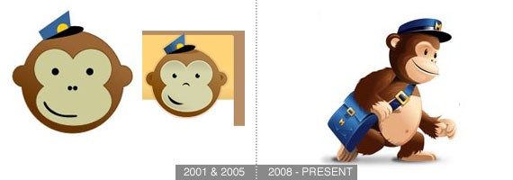
MailChimp is a free and paid email marketing service started in the 2001.
Old Logo History:
Their first logo was the iconic monkey head used in the year of 2001 until 2005. In 2006, they decided to change the monkey-icon logo with using only typography “MailChimp”.
New Logo – What has been improved:
Since 2008, MailChimp with their third generation logo has become one of the best email marketing services. The new monkey logo gives us a warm, friendly feel and overall pleasant.
15. Target
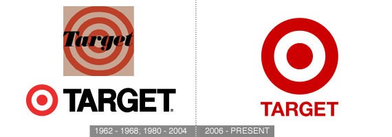
Target Corporation, usually known simply as Target, is an American retailing company that was founded in Minneapolis, Minnesota in 1902 as the Dayton Dry Goods Company.
Old Logo History:
In 1968, Target changed its bullseye logo to a more modern look. Target script used from 1980 until 2004. Changes from the original logo are that its brandmark is a single red ring with a red dot in the middle, and its wordmark uses the Helvetica font.
New Logo – What has been improved:
Target’s latest logo are in red block letters using Helvetica font that the word “Target” uses in favor of a more streamlined red “Target Brand” look. Over the survey, ninety-seven percent of American consumers recognize the Target Bullseye logo. Perhaps their logo redesign isn’t essential, but by making their Bullseye bigger that the “TARGET” characters, it obviously focusing more on their recognizable brand.
What are your thoughts about these logo redesigns? Feel free to share them with us.

Comments
Post a Comment