Golden Principles of User Interface Design
Golden Principles of User Interface Design
10 Usability Heuristics for User Interface Design
Based upon Ben Shneiderman’s “Designing the User Interface” and Jakob Nielsen’s “Ten Usability Heuristics”, 10 general principles for interaction design. They are called “heuristics” because they are broad rules of thumb and not specific usability guidelines.
1. Strive for consistency
Users should not have to wonder whether different words, situations, or actions mean the same thing. Do not confuse your user — keep words and actions consistent. Use “The Principle of Least Surprise.”

In other words, use all elements across your application consistently. For example a certain style of button should always do the same thing, or navigation should function logically, going deeper in hierarchy.
Consistency of:
- Workflow / Processes
- Functionality
- Appearance
- Terminology
2. Visibility of system status or Offer informative feedback
The system should always keep users informed about what is going on. Through appropriate feedback in a reasonable time. Don’t keep the users guessing — tell the user what’s happening.
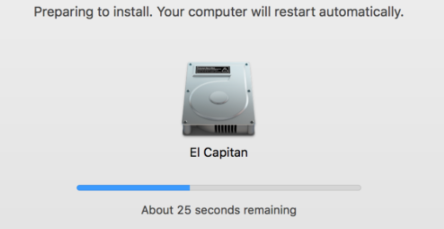
The user wants to be in control, and trust that the system behaves as expected. It could be even said that users don’t like surprises. For frequent and minor actions, the response can be modest, while for infrequent and major actions, the response should be more substantial.
Feedback:
- Relevant
- Fits importance and urgency
- Comprehensible and meaningful
- Within appropriate context (time and place)
3. Match between system and the real world or Design dialog to yield closure
Again, the less the users have to guess the better. The system should speak the users’ language (use words, phrases and concepts familiar to the user), rather than special system terms.

Sequence of actions should be organized into groups with a beginning, middle and end. When a process is finished, remember to display a notification message. Let the user know that she has done all that’s needed.
Design:
- Grouping of actions
- Explicit completion of an action
- Well-defined options for the next step
4. User control and freedom or Permit easy reversal of actions
Shneiderman puts it nicely “This feature relieves anxiety, since the user knows that errors can be undone; it thus encourages exploration of unfamiliar options.”
In applications this refers to the undo and redo functionality. Clearly mark an “emergency exit” to leave the unwanted state without having to go through an extended dialogue.
Reversal of actions:
- No interference with workflow
- More freedom for the user
- Single-action undo and action history
5. Error Prevention and Simple Error Handling
Users hate errors, and even more so hate the feeling that they themselves have done something wrong. Either eliminate error-prone conditions or check for them and notify users about that before they commit to the action.
As much as possible, design the system so the user cannot make a serious error. If an error is made, the system should be able to detect the error and offer a simple, comprehensive mechanism for handling the error.
Error Prevention:
- Error prevention over error correction
- Automatic detection of errors
- Clear error notifications
- Hints for solving the problem
6. Reduce short-term memory load or Recognition rather than recall
As Nielsen says, recognizing something is easier than remembering it. Minimize the user’s memory load by making objects, actions, and options available. The user should not have to remember information from one part of the dialogue to another. Instructions should be visible.

Use iconography and other visual aids such as themed coloring and consistent placement of items to help the returning users find the functionalities.
Reduce memory load:
- App has a clear structure
- “Recognition over recall”
- Implicit help
- Visual aids
7. Enable frequent users to use shortcuts
Allow users to tailor (manipulate and personalize) frequent actions.
Abbreviations, function keys, hidden commands, and macro facilities are very helpful to an expert user.
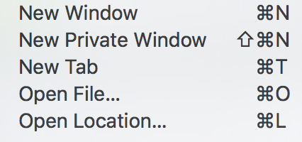
Shortcuts:
- Keyboard shortcuts
- “Power User” features
- Action automation
8. Aesthetic and Minimalist design
Minimalist doesn’t mean limited. All information should be valuable and relevant.

Simplify interfaces by removing unnecessary elements or content that does not support user tasks.
9. Help users recognize, diagnose, and recover from errors
Error messages should be expressed in plain language (don’t use system language to describe what the system is doing), precisely indicate the problem, and constructively suggest a solution.
Tell the user clearly and plainly what’s happening both on the background and when they perform an action.
10. Help and documentation
Even though it is better if the interface can be used without documentation, it may be necessary to provide help and documentation. Any help information should be easy to search, focused on the user’s task, list of concrete steps, and not too large.


Comments
Post a Comment